Chapter 3: Generating PDF based on Media Queries
In chapter 1, we converted the same hello.html page to different PDF documents that looked (almost) identical, using different snippets of Java code. In this chapter, we’ll convert one and the same HTML file to different PDF files with a different layout.
Examining the example HTML file
Figure 3.1 shows an HTML page introducing South by South West, a yearly event in Austin, Texas. This page is distributed over three browser windows; see sxsw.html and sxsw.css for the HTML and CSS code that was used to create this page. The layout of this HTML page was inspired by a design that was made available on the w3schools.com web site.
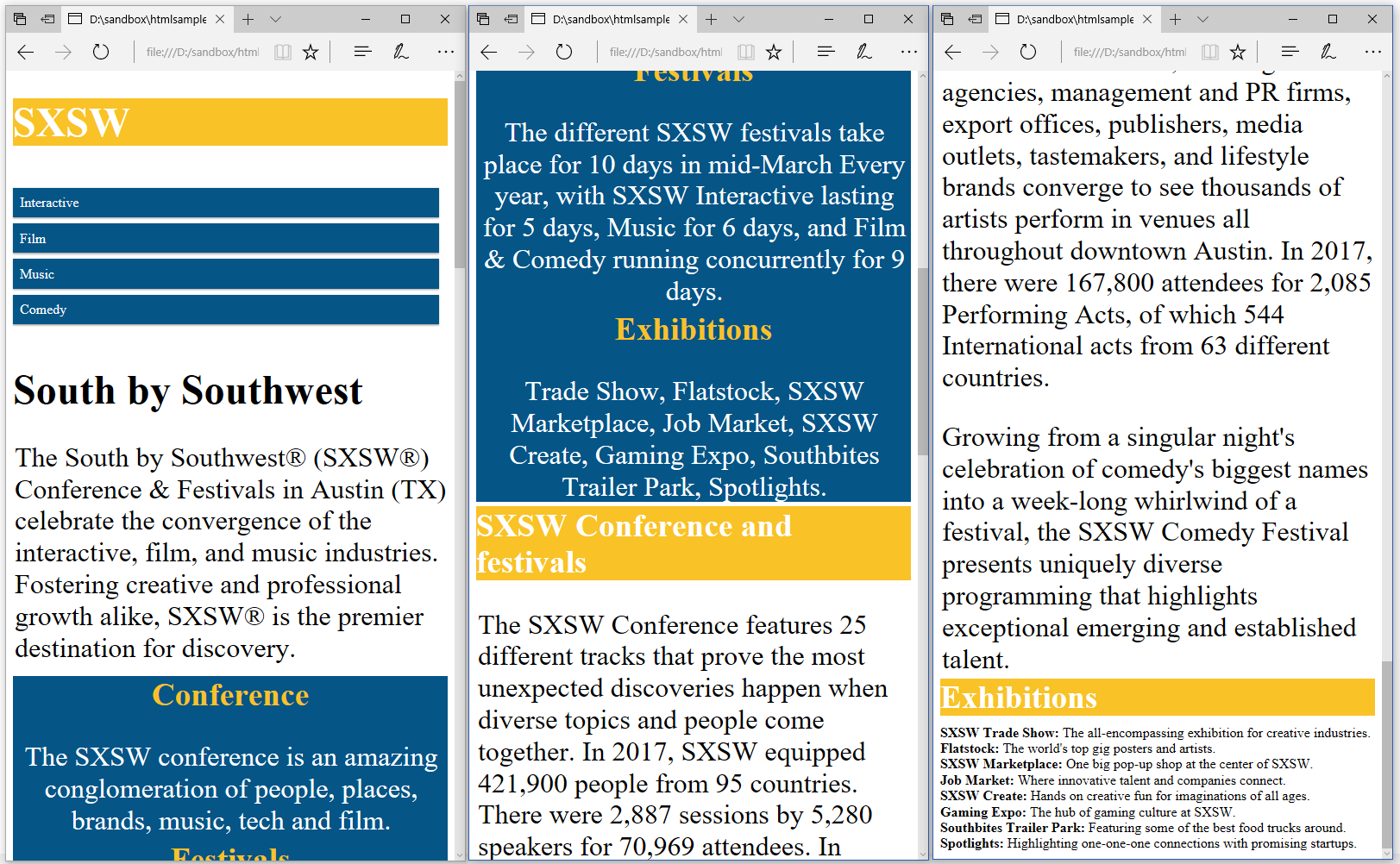
Figure 3.1: An HTML page about SXSW
In the C03E01_Normal.java example, we convert this page to PDF using our basic convertToPdf()/ConvertToPdf() example:
public void createPdf(String html, String dest) throws IOException {
    HtmlConverter.convertToPdf(html, new FileOutputStream(dest));
}public void createPdf(string html, string dest)
{
HtmlConverter.ConvertToPdf(html, new FileStream(dest, FileMode.Create));
}When we compare figure 3.2 with figure 3.1, we see that pdfHTML did a great job converting the HTML to PDF:
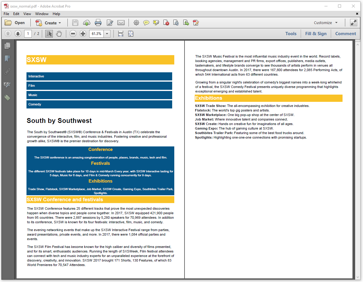
Figure 3.2: the SXSW HTML page as PDF document
The colors in this page were defined using CSS. If you examine sxsw.css, you'll discover snippets like these:
h2 {
    color:#F9C227;
    margin: 0px;
}
.header{
    background-color: #F9C227;
    color: #FFFFFF;
    margin-bottom:10px;
}
This CSS snippet defines the colors and some metrics for a header block such as the following snippet from the sxsw.html file:
<h2 class="header">SXSW Conference and festivals</h2>These colors are nice when we look at the page on a screen, but when we print that page, we might want to avoid using too much color. Printers are cheap; ink cartridges are expensive. What if there was a way to save on colored ink when printing our documents?
Creating a PDF file for Print
There's something peculiar about the <head> section of sxsw.html. It contains links to two different CSS files:
<head>
    <meta name="viewport" content="width=device-width, initial-scale=1.0">
    <link rel="stylesheet" type="text/css" href="css/sxsw.css"/>
    <link rel="stylesheet" media="print only" href="css/sxsw_print.css">
</head>
The sxsw.css style sheet is used when we view the HTML page in a browser on a screen. However, there's a second style sheet, sxsw_print.css, and the tag referring to this style sheet has a media attribute with as value "print only". This is the style sheet that will be used when you print the HTML page, and the color values in this style sheet are slightly different from what we had before.
For instance, the CSS for the h2 tag and the header class look like this:
h2 {
    color:#FFFFFF;
    margin: 0px;
    font-size:18pt
}
.header{
    background-color: #000000;
    color: #FFFFFF;
    margin-bottom:10px;
}
The colors used in sxsw.css are changed into black (#000000) and white (#FFFFFF).
By default, pdfHTML assumes that you want to create a PDF that will be viewed on the screen, but if it's your intention to create a PDF document for printing, you can define "Print" as the media device description through the converter properties. This is what we've done in the C03E02_Print example.java.
public void createPdf(String baseUri, String src, String dest) throws IOException {
    ConverterProperties properties = new ConverterProperties();
    properties.setBaseUri(baseUri);
    MediaDeviceDescription mediaDeviceDescription =
        new MediaDeviceDescription(MediaType.PRINT);
    properties.setMediaDeviceDescription(mediaDeviceDescription);
    HtmlConverter.convertToPdf(
        new FileInputStream(src), new FileOutputStream(dest), properties);
}public void createPdf(String baseUri, String src, String dest)
{
ConverterProperties properties = new ConverterProperties();
properties.SetBaseUri(baseUri);
MediaDeviceDescription mediaDeviceDescription =
new MediaDeviceDescription(MediaType.PRINT);
properties.SetMediaDeviceDescription(mediaDeviceDescription);
HtmlConverter.ConvertToPdf(
new FileInfo(src), new FileInfo(dest), properties);
}In this example, we create a MediaDeviceDesciption (Java/.NET) with PRINT (Java/.NET) as MediaType(Java/.NET), and we use this MediaDeviceDescription (Java/.NET) to set the ConverterProperties (Java/.NET) for the conversion process. The resulting PDF document is shown in figure 3.3.
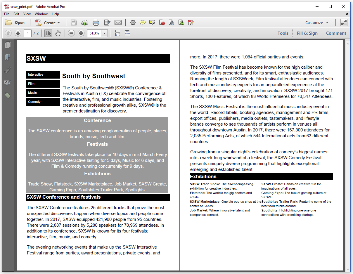
Figure 3.3: the SXSW page "for print"
Note that the layout of this document for print is slightly different from the layout of the PDF shown in figure 3.2. This is also caused by differences in the style sheet.
If we take a closer look to sxsw.css, we see that it contains different parts that depend on the width of the screen. The sxsw.html page is a responsive web page that adapts itself to the size of the screen.
Responsiveness in HTML
In figure 1.1, the screen was rather narrow, as is often the case on a smart phone. In this case, the following (default) CSS definitions are used for p, h1, and h2:
@media only screen{
    p{
        font-size: 24pt;
    }
    h1{
        font-size: 36pt;
    }
    h2{
        font-size:28pt
    }
}
In the previous chapter, we already worked with an @page at-rule to create a footer. In this example, we use @media to define some styles that are only used when the page is shown on a screen.
However, there's more than one @media at-rule in the CSS file. We also have:
@media only screen and (min-width: 600px) {
    .col-1-m {width: 24.9%;}
    .col-2-m {width: 49.9%;}
    .col-3-m {width:74%}
    .col-4-m {width: 99%;}
    p{
        font-size: 16pt;
    }
    h1{
        font-size: 24pt;
    }
    h2{
        font-size:18pt
    }
}
When we resize the browser window, so that it's minimum 600 pixels wide as shown in figure 3.4, we get a different layout.
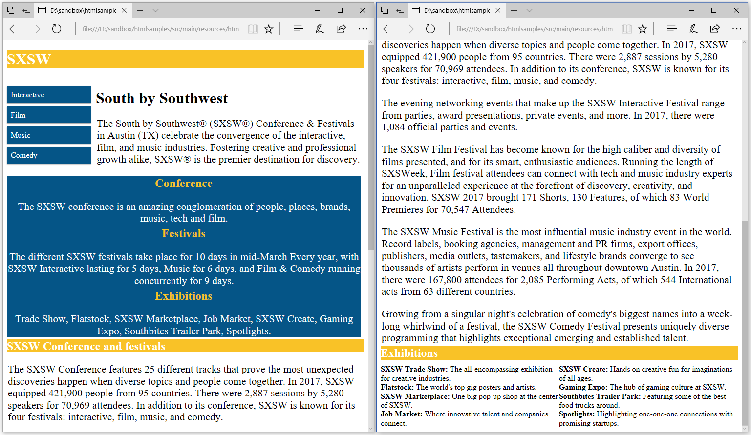
Figure 3.4: responsiveness in HTML (medium width)
Font sizes are smaller, but there are also classes that define a different element width. If we look inside the HTML file, we see that some of these classes are used for the upper part of the page:
<div class="one col-1-m col-1 menu">
<ul>
<li>Interactive</li>
<li>Film</li>
<li>Music</li>
<li>Comedy</li>
</ul>
</div>
<div class="two col-3-m col-3 ">
<h1>South by Southwest</h1>
<p>The South by Southwest® (SXSW®) Conference &
Festivals in Austin (TX) celebrate the convergence of the interactive,
film, and music industries. Fostering creative and professional growth
alike, SXSW® is the premier destination for discovery.</p>
</div>
<div class="three col-4-m col-1">
<div class="aside">
<h2>Conference</h2>
<p>The SXSW conference is an amazing conglomeration of
people, places, brands, music, tech and film.</p>
<h2>Festivals</h2>
<p>The different SXSW festivals take place for 10 days in
mid-March Every year, with SXSW Interactive lasting for 5 days,
Music for 6 days, and Film & Comedy running concurrently
for 9 days.</p>
<h2>Exhibitions</h2>
<p>Trade Show, Flatstock, SXSW Marketplace, Job Market,
SXSW Create, Gaming Expo, Southbites Trailer Park, Spotlights.</p>
</div>
</div>We distinguish three <div> elements that can be rendered as three columns (one , two , and three).
When we look at figure 3.4, we see that column one and column two are put next to each other, whereas column three is displayed under those two columns. This behavior is due to the way we defined the classes col-1-m, col-2-m, and col-3-m in the CSS file. The width of column one is 24.9% (col-1-m) and the width of column two is 74% (col-2-m). 24.9% + 74% = 98.9%, which means that there's sufficient space to put both columns next to each other, but there's no space left for column three. That column needs 99% (col-4-m) of the total width.
The classes col-1-m, col-2-m, and col-4-m are used when the page is displayed at a minimum width of 600 pixels, but when the width reaches 768 pixels, the values of these classes are overridden:
@media only screen and (min-width: 768px ) {
        .col-1 {width:24.9%;}
        .col-2 {width: 33.32%;}
        .col-3 {width: 49%;}
        .col-4 {width: 99%;}
        p{
            font-size: 12pt;
        }
        h1{
            font-size: 20pt;
        }
        h2{
            font-size:16pt
        }
}
We have the same three columns, and the width of column one is still 24.9% (col-1), but the width of column two is now 49% (col-3), and the width of column three has been reduced to 24.9% (col-1). If we add up all those percentages, the total width is lower than 100%, which means that the three columns fit nicely next to each other as shown in figure 3.5.
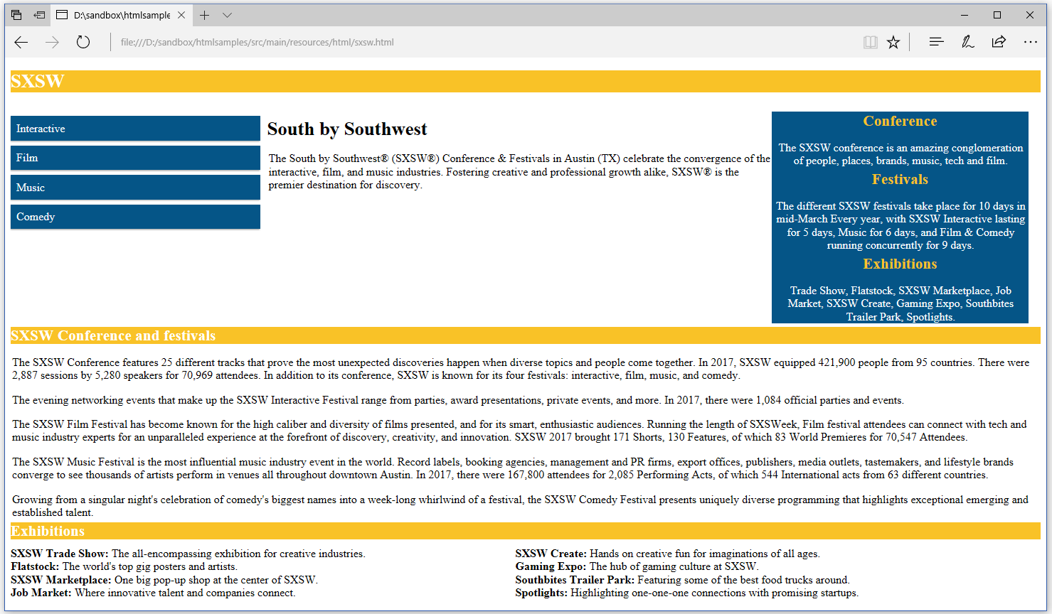
Figure 3.5: responsiveness in HTML (wide view)
Using @media to make a web page responsive is standard practice in HTML, but what about PDF?
There's a huge conceptual difference between HTML and PDF:
HTML is intended to convey higher level information such as paragraphs and tables. Although there are methods to control their layout, it's ultimately up to the browser to draw these higher level concepts. Imagine an HTML document with a paragraph that's 100% wide. Depending on the width of your browser window, this paragraph might take 2 lines or 10 lines, and when you print it it might be 7 lines, and when you look at it on your phone it might take 20 lines.
PDF is intended to convey documents, and these documents must always look the same wherever they are rendered. A PDF file must be independent of the rendering device. Regardless of the screen size, it must always render exactly the same content in the same layout. Because of these musts, the PDF creation process doesn't usually support abstract things like "tables" or "paragraphs" (mind the usually in this sentence; we'll further discuss this when we talk about Tagged PDF in the final section of this chapter). There are three basic things that basic PDF syntax supports: text, lines/shapes and images. In a PDF you don't say "here's a paragraph, PDF viewer: do your thing!" Instead you say: "draw this text at this exact X,Y location using this exact font and don't worry, I've previously calculated the width of the text so I know it will all fit on this line." You also don't say "Here's a table!" You say: "Draw this text at this exact location and then draw a rectangle at this other exact location that I've previously calculated so I know it will appear to be around the text."
All the difficult stuff of calculating how many lines of a paragraph fit on a page, how to distribute the cells of a table on one or more pages, and where to draw the text and the borders of those cells, are done by iText's layout engine; pdfHTML converts HTML tags into instructions that are understood by iText, and once the PDF is created, that layout is fixed. Changing the size of the PDF viewer window doesn't change the layout the way the layout of an HTML page changes when you resize the browser window.
There are plans for a new format, currently codenamed Next-Generation PDF that boils down to bundling different views of the same document into one file. A viewer would then show one specific view based on media queries. For instance: a Next-Generation PDF file could contain the file shown in figure 3.2 as well as the file shown in figure 3.3. When opened in the PDF viewer on the screen, you'd see what is shown in figure 3.2. When printing the file, you would get what is shown in figure 3.3.
With pdfHTML, we are proactively preparing for support for this new document format. In the next three examples, we'll convert the same SXSW HTML page to three PDFs, one that is best suited for the desktop, one that is best suited for a tablet, and one that can easily be viewed on a smartphone. In a Next-Generation PDF document, these three different versions of the same document could be bundled into one file.
Creating a PDF for the desktop
Suppose that we want to create a PDF using the CSS that is defined using the @media rule only screen and (min-width: 768px ). In that case, we need to use MediaType.SCREEN (Java/.NET) instead of MediaType.PRINT(Java/.NET), and we need a page width that is at least 768px.
In the C03E03_Wide example.java, we convert the HTML to a PDF file of which the pages are in the A4 format with landscape orientation. Such a page measures 842 x 595 user units.
public void createPdf(String baseUri, String src, String dest) throws IOException {
    PdfWriter writer = new PdfWriter(dest);
    PdfDocument pdf = new PdfDocument(writer);
    pdf.setTagged();
    PageSize pageSize = PageSize.A4.rotate();
    pdf.setDefaultPageSize(pageSize);
    ConverterProperties properties = new ConverterProperties();
    properties.setBaseUri(baseUri);
    MediaDeviceDescription mediaDeviceDescription
        = new MediaDeviceDescription(MediaType.SCREEN);
    mediaDeviceDescription.setWidth(pageSize.getWidth());
    properties.setMediaDeviceDescription(mediaDeviceDescription);
    HtmlConverter.convertToPdf(new FileInputStream(src), pdf, properties);
}public void createPdf(String baseUri, String src, String dest)
{
PdfWriter writer = new PdfWriter(dest);
PdfDocument pdf = new PdfDocument(writer);
pdf.SetTagged();
PageSize pageSize = PageSize.A4.Rotate();
pdf.SetDefaultPageSize(pageSize);
ConverterProperties properties = new ConverterProperties();
properties.SetBaseUri(baseUri);
MediaDeviceDescription mediaDeviceDescription
= new MediaDeviceDescription(MediaType.SCREEN);
mediaDeviceDescription.SetWidth(pageSize.GetWidth());
properties.SetMediaDeviceDescription(mediaDeviceDescription);
HtmlConverter.ConvertToPdf(new FileStream(src, FileMode.Open), pdf, properties);
}We define the page size in lines 5 and 6. We create a MediaDeviceDescription (Java/.NET) in lines 9 and 10, and we set the type to MediaType.SCREEN (Java/.NET) in line 11. We set the width of the page as the width for the MediaDeviceDescription(Java/.NET).
What is the relationship between pt and px?
In our CSS, the measurements were expressed in pixels: 600px and 768px. There are 96 pixels in one inch. In PDF, measurements are expressed in user units. One user unit corresponds with one point by default. There are 72 points in one inch. See the FAQ entry How do the measurement systems in HTML relate to the measurement system in PDF? for a more in-depth answer.
In the context of the boundaries defined in the CSS file of our example, we can calculate the following widths:
600px = 6.25in = 450pt
768px = 8in = 576pt
We'll have to keep the values 450pt and 579pt in mind when defining page sizes.
Take a look at figure 3.6 to see the resulting PDF when converting our SXSW HTML page to a PDF using the media query where the width is greater than 576pt.
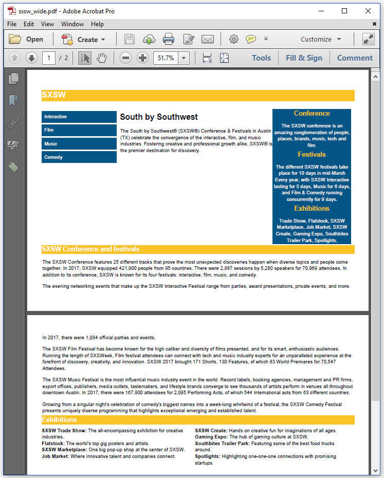
Figure 3.6: the SXSW PDF for a desktop screen
This PDF looks very similar to the "wide view" of the HTML page shown in figure 3.5.
Now let's create a PDF with a smaller page width.
Creating a PDF for a tablet
In the C03E04_Medium.java example, we define a custom page size that is smaller than 576, but wider than 450.
public void createPdf(String baseUri, String src, String dest) throws IOException {
    PdfWriter writer = new PdfWriter(dest);
    PdfDocument pdf = new PdfDocument(writer);
    pdf.setTagged();
    PageSize pageSize = new PageSize(575, 1500);
    pdf.setDefaultPageSize(pageSize);
    ConverterProperties properties = new ConverterProperties();
    properties.setBaseUri(baseUri);
    MediaDeviceDescription mediaDeviceDescription
        = new MediaDeviceDescription(MediaType.SCREEN);
    mediaDeviceDescription.setWidth(pageSize.getWidth());
    properties.setMediaDeviceDescription(mediaDeviceDescription);
    HtmlConverter.convertToPdf(new FileInputStream(src), pdf, properties);
}public void createPdf(String baseUri, String src, String dest)
{
PdfWriter writer = new PdfWriter(dest);
PdfDocument pdf = new PdfDocument(writer);
pdf.SetTagged();
PageSize pageSize = new PageSize(575, 1500);
pdf.SetDefaultPageSize(pageSize);
ConverterProperties properties = new ConverterProperties();
properties.SetBaseUri(baseUri);
MediaDeviceDescription mediaDeviceDescription
= new MediaDeviceDescription(MediaType.SCREEN);
mediaDeviceDescription.SetWidth(pageSize.GetWidth());
properties.SetMediaDeviceDescription(mediaDeviceDescription);
HtmlConverter.ConvertToPdf(new FileStream(src, FileMode.Open), pdf, properties);
}The only difference between this code snippet and the previous one can be found in line 5. Instead of an A4 page in landscape, we now use a custom page size of 575 by 1500 pt.
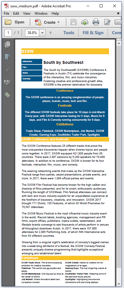
Figure 3.7: the SXSW PDF for a tablet screen
The resulting PDF shown in figure 3.7 looks very much like the HTML we had in figure 3.4.
Finally, let's change the page size one more time, now with a width smaller than 450pt.
Creating a PDF for a smartphone
Let's create a PDF with a page size of 440 by 2000 user units.
See line 5 in the C03E05 Narrow.java example:
public void createPdf(String baseUri, String src, String dest) throws IOException {
    PdfWriter writer = new PdfWriter(dest);
    PdfDocument pdf = new PdfDocument(writer);
    pdf.setTagged();
    PageSize pageSize = new PageSize(440, 2000);
    pdf.setDefaultPageSize(pageSize);
    ConverterProperties properties = new ConverterProperties();
    properties.setBaseUri(baseUri);
    MediaDeviceDescription mediaDeviceDescription
        = new MediaDeviceDescription(MediaType.SCREEN);
    mediaDeviceDescription.setWidth(pageSize.getWidth());
    properties.setMediaDeviceDescription(mediaDeviceDescription);
    HtmlConverter.convertToPdf(new FileInputStream(src), pdf, properties);
}public void createPdf(String baseUri, String src, String dest)
{
PdfWriter writer = new PdfWriter(dest);
PdfDocument pdf = new PdfDocument(writer);
pdf.SetTagged();
PageSize pageSize = new PageSize(440, 2000);
pdf.SetDefaultPageSize(pageSize);
ConverterProperties properties = new ConverterProperties();
properties.SetBaseUri(baseUri);
MediaDeviceDescription mediaDeviceDescription
= new MediaDeviceDescription(MediaType.SCREEN);
mediaDeviceDescription.SetWidth(pageSize.GetWidth());
properties.SetMediaDeviceDescription(mediaDeviceDescription);
HtmlConverter.ConvertToPdf(new FileStream(src, FileMode.Open), pdf, properties);
}Now we have all the content on two long, but narrow PDF pages, with a font size that is significantly higher than we had before.
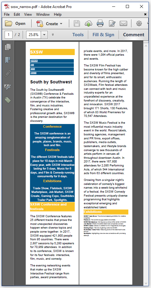
Figure 3.8: the SXSW PDF for a smartphone screen
This PDF is easier to consume on a smart phone than the PDF rendered on A4 pages in landscape.
When looking at the code of the last three examples, you may have wondered about a strange line I sneaked in. In line 4, I tell iText to create a Tagged PDF.
Because of this extra line of code, iText will also add the semantic structure of the document to the PDF.
The semantic structure of a document
I already explained that there's a huge conceptual difference between HTML and PDF. In HTML, you have structures such as headers (<h1>, <h2>,...), paragraphs (<p>), lists and list items (<ul>, <ol>, li), and so on. The browser looks at these structures and renders the page on the fly.
When you create a PDF file, pdfHTML interprets these structures, converts them to iText objects, and iText renders these objects to a page by drawing text, lines, and shapes at absolute positions on a canvas. If you don't use the setTagged() / SetTagged() method, all structure is lost in the process. A line of text on a PDF page doesn't know if it's the title of a chapter, if it's part of a paragraph, or if it's a list item. That information is gone. There is just a bunch of text on a page.
When you use the setTagged() / SetTagged() method however, you add a structure tree to the PDF. In figure 3.9, we have made part of this structure tree visible in Adobe Acrobat. You recognize <Div> elements, <P>, <L> and <LI>.
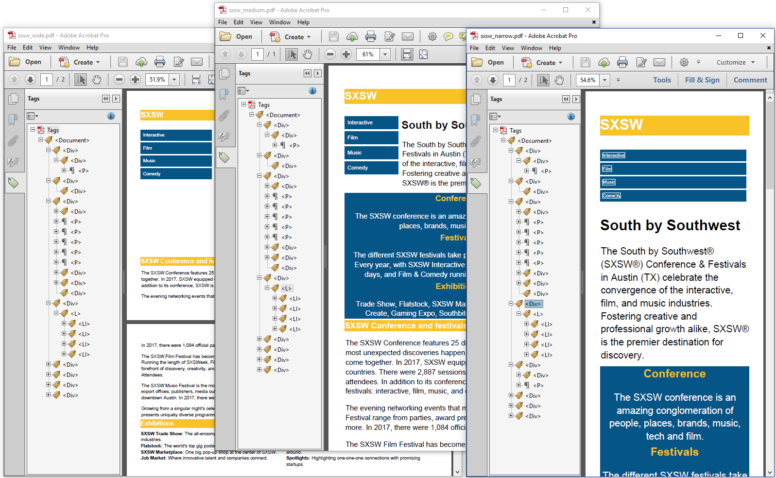
Figure 3.9: The structure of the PDF is independent of its layout
In figure 1.5 in chapter 1, we also discovered elements such as <Span> and <Figure>. These are tags for the PDF document that are stored in the PDF file in a separate structure tree. This structure tree refers to marked content on the different pages. This structure is important when the PDF is consumed by Assistive Technology (AT). When this structure is present, the document can be read in an unambiguous way by people who are blind or visually impaired.
Assistive technology is an umbrella term that includes assistive, adaptive, and rehabilitative devices for people with disabilities and also includes the process used in selecting, locating, and using them. Assistive technology promotes greater independence by enabling people to perform tasks that they were formerly unable to accomplish, or had great difficulty accomplishing, by providing enhancements to, or changing methods of interacting with, the technology needed to accomplish such tasks.
If you examine figure 3.9, you can see that, although the layout of the three resulting PDF files is different, the structure tree remains identical. There is a clear separation between structure and presentation.
Tagged PDF will also be important in the context of Next-Generation PDF. The Next-Generation PDF specification defines a derivation algorithm that allows a PDF processor to convert a PDF document to a responsive HTML file. By providing functionality to create properly tagged PDFs, we are ready to support Next-Generation PDF once the specification is finalized. Once that happens, we'll be able to convert HTML to PDF, and back!
A web application (powered by iText!) has been developed to demonstrate the functionality of the derivation algorithm, and is freely available at ngpdf.com. In addition, we collaborated with its developers Dual Lab on a webinar and white paper which go into more detail on the history of semantic PDF and the internals of the ngPDF implementation.
We'll revisit Tagged PDF in the next chapter, when we talk about PDF/A.
Summary
In this chapter, we took a responsive HTML file, and we converted this file to different PDF documents by defining different media queries. We created a PDF that used a CSS file written especially for when the HTML file is to be printed. We also used media queries that adapted the content to the width of the screen. In the next chapter, we'll take a look at some examples and best practices when using pdfHTML as a reporting engine.
