Similar questions were posted on Stack Overflow, for instance on Aug 28, '14 by NMathur and on Jan 29, '13 by Shawson
If you live in the US, you probably use inches (in) to measure the size of a page, the size of a screen, and so on. If you live outside of the US, you are probably more familiar with the metric system, a decimal measuring system based on the meter (mm, cm). If you're working in an international context, you have to switch between both systems:
1 in. = 25.4 mm = 2.54 cm = 0.254 dm = 0.0254 m
PDF uses yet another measurement unit. Let's consult ISO 32000:
ISO 32000-2: 8.3.2.3 User space
The length of a unit along both the x and y axes is set by the UserUnit entry in the page dictionary. If that entry is not present or supported, the default value of 1/72 inch is used. (...) The default for the size of the unit in default user space (1/72 inch) is approximately the same as a point, a unit widely used in the printing industry. It is not exactly the same, however; there is no universal definition of a point.
ISO 32000-2: 7.7.3.3 Page objects
UserUnit: A positive number that shall give the size of default user space units, in multiples of 1/72 inch. The range of supported values shall be implementation-dependent.
The default value of the UserUnit is 1, so unless we change the UserUnit deliberately, we don't have to worry about this feature. We can conclude that PDF uses the user unit as measurement unit. By default 1 user unit equals 1 point, which means that:
1 in. = 25.4 mm = 72 user units.
In the printing industry, the point is often used to express the size of a font. For instance: when I open Word on my PC, the default font is Calibri with a font size of 11pt. Although ISO 32000 claims that there is no universal definition of a point, it is safe to assume that 1 point is 1/72 of an inch, or:
1 in. = 25.4 mm = 72 pt.
In digital imaging, we often work with pixels. In the context of raster images, the size of a pixel depends on the resolution. We often use the terms dots per inch (DPI) and pixels per inch (PPI) interchangeably. There's a difference, but it would lead us too far to go into detail, but let's say that you render an image of 300 x 300 pixels at 300 DPI, then that image will measure 1 x 1 in. However, if you render the same image at 96 DPI (the historical value of Windows' display resolution), then that image will measure 3.125 x 3.125 in.
If you examine CSS files found in the wild, you will notice that many sizes are expressed in pixels. For instance: <img src="logo.img" style="width: 300px">. It's impossible to calculate this width in inches or millimeters without knowing the resolution, but there is a common understanding that 1 pixel is 1 / 96 of an inch in the context of HTML, hence:
1 in. = 25.4 mm = 96 px.
Several other measurement units can be used in CSS (see the W3C on CSS units).
A pica (pc) is a hair less than 1/6 inch, and contains 12 points. Picas are typically used to represent fixed horizontal measurements, most often column width.
1 in. = 25.4 mm = 6 pc.
The above measurement units are absolute; there are also several relative measurement units:
-
The emphemeral unit (
em) is a CSS unit that stands for the size of the font of the element. If you have an element of which the font-size is defined as 12pt, then 1 em = 12pt. Originally,emwas equal to the width of the capital letter M, which is where its name originated. -
The root em (
rem) stands for the font size of the root element of the HTML file. The size of 1 rem is independent of the font-size defined for the element. -
The
exunit is related to the x-height of a font. The x-height is roughly the height of lowercase letters such as a, c, m, or o. The ex unit is rarely used. -
You can also express a width as a percentage (
%) of the available width.
All of these measurement styles are supported by pdfHTML.
See for instance the measurements.html HTML file:
<html>
    <head><title>Measurements</title>
        <style>
            div { border: solid black 1px; }
        </style>
    </head>
    <body>
        <h1>Measurements</h1>
        <div>Div with width no width specified</div>
        <div style="width: 4in">Div with width 5in</div>
        <div style="width: 10cm">Div with width 10cm</div>
        <div style="width: 100mm">Div with width 100mm</div>
        <div style="width: 300px">Div with width 300px</div>
        <div style="width: 300pt">Div with width 300pt</div>
        <div style="width: 25pc">Div with width 25pc</div>
        <div style="width: 25em">Div with width 25em</div>
        <div style="font-size: 6pt; width: 25em">Div with width 25em</div>
        <div style="width: 25rem">Div with width 25rem</div>
        <div style="font-size: 6pt; width: 25rem">Div with width 25rem</div>
        <div style="width: 25ex">Div with width 25ex</div>
        <div style="font-size: 6pt; width: 25ex">Div with width 25ex</div>
        <div style="width: 60%">Div with width 60%</div>
    </body>
</html>
In this HTML page, we add a solid black border to every <div> tag. When we don't define a width for the <div>, 100% of the available width is used. In the example, we use different measurement units: 4in, 10cm, 100mm, 300px, 300pt, 25pc, 25em, 25rem, 25ex. and 60%.
The result shown in the browser is very similar to the result shown in the PDF created from this HTML file using pdfHTML with the C07E09_Measurements (Java/.NET) example:
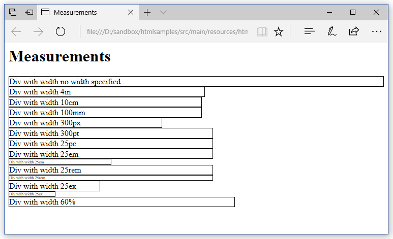
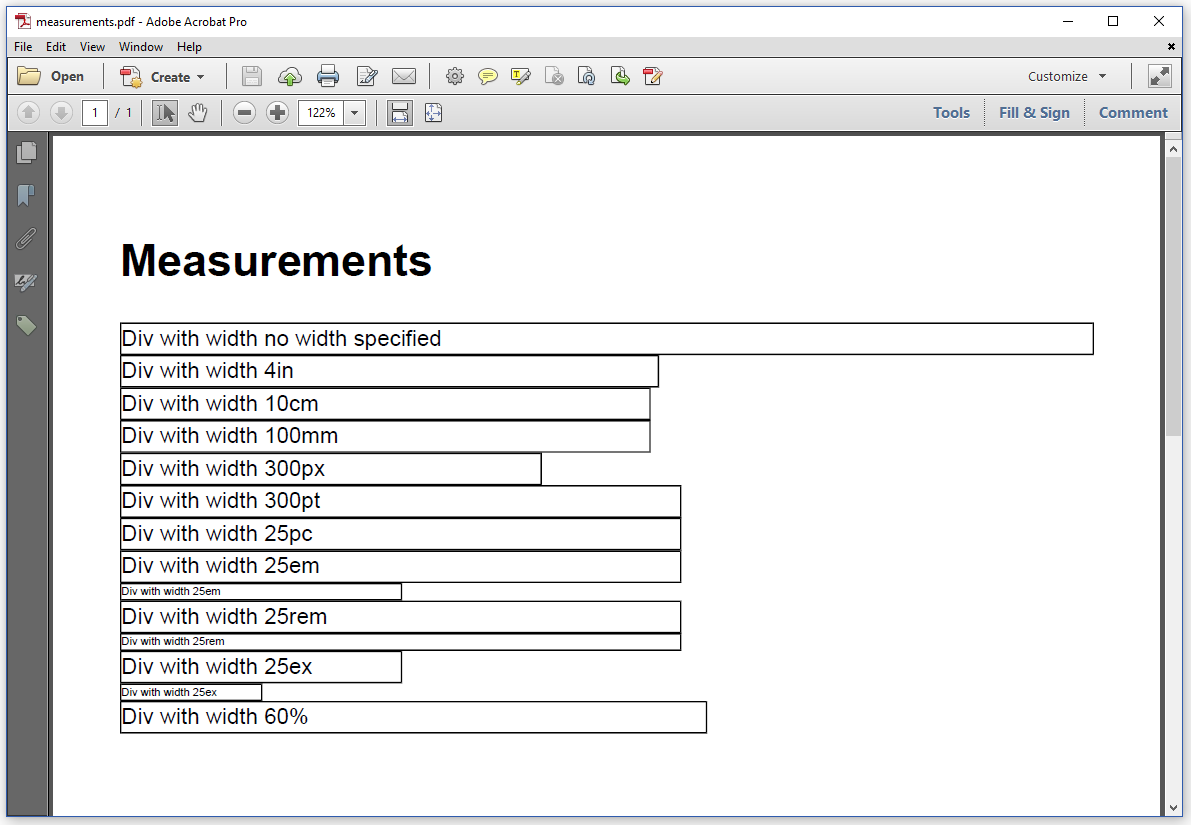
We see that the width of the <div> that measures 300px is three quarters (or 72/96) of the width of the <div> that measures 300pt. A width of 300pt is equal to a width of 25pc. The default font size used by iText is 12. If we have a <div> using the default font-size and a width of 25 em, then the absolute width of this <div> will be 12pt x 25, which is also 300pt. The same is true for the <div> with a width of 25 rem. However, when we reduce the font size to 6pt, then the <div> is only half as wide for the <div> where we used em as measurement unit, whereas the width doesn't change for the <div> where we used rem. We used a font where 1 ex is about half of 1 em.