With the release of pdfHTML 3.0.4, we are pleased to announce support for the CSS Flexible Layout Box module.
Background
CSS Flexible Box Layout (commonly known as Flexbox) is a CSS 3 web layout model. It is currently in the W3C's candidate recommendation stage, although has been around for a number of years now and has proven to be popular since it's a simple, reliable, and fast solution with wide browser support. The flex layout allows responsive elements within a container to be automatically arranged depending upon the screen size.
Before the Flexbox Layout module, there were four layout modes:
-
Block, for sections in a webpage
-
Inline, for text
-
Table, for two-dimensional table data
-
Positioned, for explicit position of an element
The Flexible Box Layout Module makes it easier to design a flexible responsive layout structure without using floats or positioning. You can refer to A Complete Guide to Flexbox for more details, such as all the different possible properties for the parent (flex container) element and the child (flex items) elements. There are also many useful resources there including history, demos, patterns, and a browser support chart.
In pdfHTML 3.0.4 we've added initial support for the flexbox framework. The support of all flexbox properties is not comprehensive yet, however, it can already handle a lot of use-cases.
Reminder
All you need to do to convert the HTML code below into PDF, is run one of the methods from the HtmlConverter class in Java or .NET, e.g.
HtmlConverter.convertToPdf(htmlString, outputStream)
HtmlConverter.ConvertToPdf(htmlString, stream)
Example
In the following example, we'll use the following HTML code for a pretty common use-case - the creation of a two-column layout stretched to the full width of the page.
<html>
<head>
<title>
Example
</title>
<style>
* {
font-family: Arial;
}
p{
font-size: 14px;
line-height: 127%;
text-indent: 20px;
}
.bordered{
border: 1px dotted lightgray;
padding: 10px;
box-sizing: border-box;
}
.header{
width: 100%;
flex: 1 0 100%;
}
.blue-column {
background-color: #ffeeee;
}
.green-column {
background-color: #eeffee;
}
/*flex related part*/
.flex-container {
display: flex;
flex-direction: row;
width: 100%;
}
.flex-column-item{
flex-grow: 1;
flex-shrink: 0;
flex-basis: 40%;
}
</style>
</head>
<body>
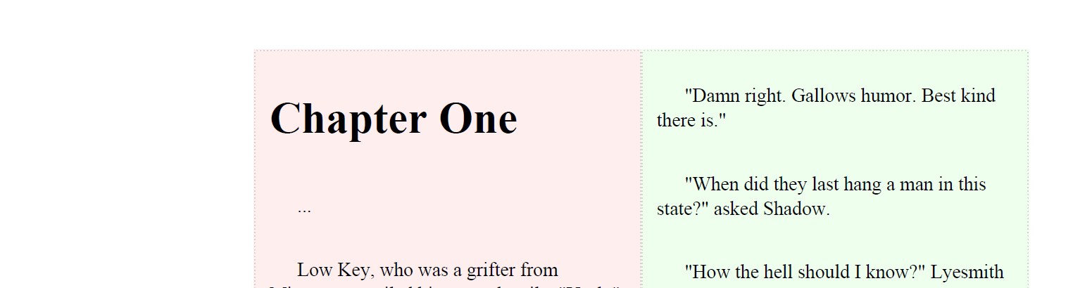
<div class="flex-container ">
<div class="flex-column-item blue-column bordered">
<h1>
Chapter One
</h1>
<p>
...
</p>
<p>
Low Key, who was a grifter from Minnesota, smiled his scarred smile. "Yeah," he said. "That's true. It's even better when you've been sentenced to death. That's when you remember the jokes about the guys who kicked their boots off as the noose flipped around their necks, because their friends always told them they'd die with their boots on."
</p>
<p>
"Is that a joke?" asked Shadow.
</p>
</div>
<div class="flex-column-item green-column bordered">
<p>
"Damn right. Gallows humor. Best kind there is."
</p>
<p>
"When did they last hang a man in this state?" asked Shadow.
</p>
<p>
"How the hell should I know?" Lyesmith kept his orange-blond hair pretty much shaved. You could see the lines of his skull. "Tell you what, though. This country started going to hell when they stopped hanging folks. No gallows dirt. No gallows deals."
</p>
</div>
</div>
</body>
</html>
These styles define the flexbox-related behavior.
.flex-container {
	display: flex; /* pdfHTML does not support inline-flex yet*/
	flex-direction: row; /* items must be placed in a row */
	width: 100%;
}

.flex-column-item{
	flex-grow: 1; /*the remaining space in the container will be distributed equally to all children*/
	flex-shrink: 0; /* no shrink of the items*/
	flex-basis: 40%; /*default-width for an element */
}
As you can see, the flex columns stretch to the full width of the page, regardless of their width.
Justify-content property
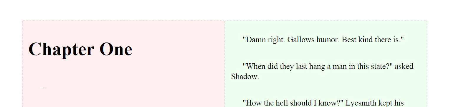
Sometimes it may be necessary to keep their initial width (40% in our case).
In that case, you may also want to specify their positioning. This can be done using the justify-content property.
This defines the alignment along the main axis. It helps distribute extra free space leftover when either all the flex items on a line are inflexible, or are flexible but have reached their maximum size
pdfHTML 3.0.4 supports the following values : start, end, flex-start, flex-end, left, right, and center.
To do this, we'll need to adjust our styles.
.flex-container {
       justify-content: flex-end;  /* columns will be placed at the right border of the container as our direction is left-to-right*/

       ....
}

.flex-column-item{
        flex-grow: 0; /* children`s width won`t be enlarged*/
         ....
}
As a result, we now have two columns placed at the right border of the page.